
Not pretty.
We looked at mimicking the 3145 format:

But it wastes a ton of page space, and we wanted to be a bit more distinct.
So I whipped up this side-and-top bar layout (top two in the picture, compared to two official TRO layouts):

And that was good enough for us to get the first preview out the door.

But it still wasn't great.
We dabbled in madness with unit type icons in the sidebar and factional banners along the top.

The unit icons we quickly discarded, but people were quite enthusiastic about the banner, to the extent that I tried making the sidebar itself a banner. It was pretty popular and we were working with this one for a while:

Eventually I nixed it because we couldn't get the banners for all the factions and we didn't want to have them be inconsistent. And also, their "fair use" status was particularly uncertain, since they were from the HBS BT. I still have a soft spot for that one though.
In moving on, debate raged over the plain three-column layout vs the top-and-bottom section layout (I don't have a picture of the two-column ones, sadly):

Finally, we settled on two sections of three columns.

The bars were intended to change with each faction, but the purple metal look was never great and it would add a lot of unecessary layout hassle, so we moved to a more neutral look:

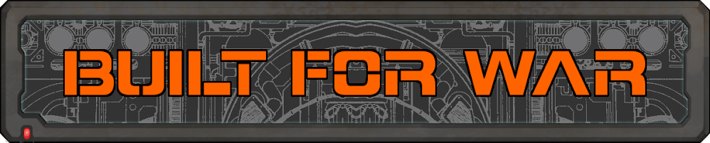
And finally, replaced the slapdash textured bar with a cleaner, more vibrant hand-drawn one:

And that's where we're at now. Not half bad, I think.


